 First Steps in R
The “base” 2-D graphics options in R are included in the base package graphics (plot, hist, boxplot, etc.):
> par("pch")                          # default plotting symbol (open circle)
[1] 1
> par(pch=2)                          # change symbol (open triangle)

> par("lty")                          # default line type
[1] "solid"
> par("lwd")                          # default line width
[1] 1
> par("col")                          # default colour
[1] "black"
>  par("mfrow")                       # default number of rows & columns (filled row-wise)
[1] 1 1
> par("mfcol")                        # default number of rows & columns (filled column-wise)
[1] 1 1
The plotting process will then be:
> pdf(myfile.pdf,width=10.,height=7.1)        # landscape output plot in PDF format
> postscript(myfile.ps)                       # PS output
> png(myfile.png)                             # PNG
> jpeg(myfile.jpeg)                           # JPG
2. Make a plot (see main functions below)
> plot(x,y)
3. Close device
> dev.off()
plot: this function makes scatterplots or other types of R objects plots
abline: add a straight line to a plot
lines: add connected line segments to a plot
segments: add disconnected line segments to a plot
points: add points to a plot
arrows: add arrows to a plot
polygon: add polygons to a plot
text: add text labels to a plot
title: add labels for X,Y axes, title, subtitle, outer margin
axis: modify axes ticks and axes labels
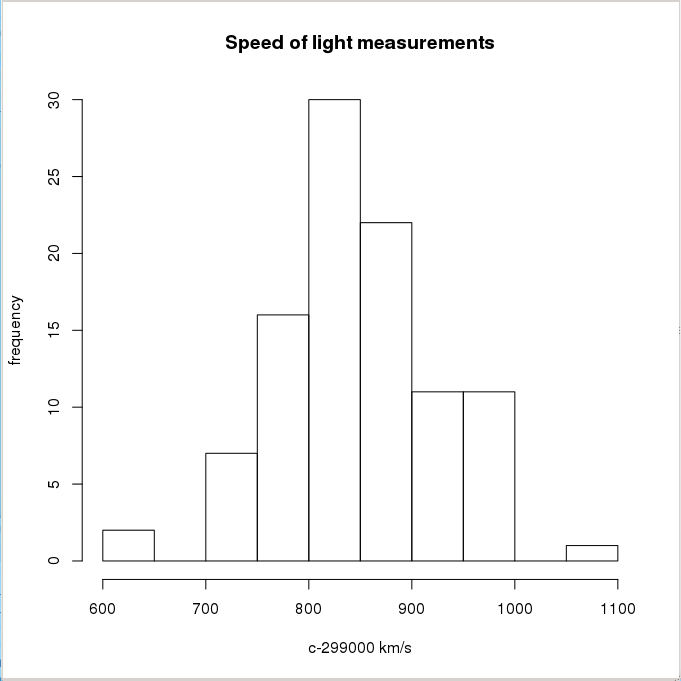
Let’s take the light velocity measures done by Michelson and Morley in their famous experiment. They performed 5 series (Expt) with 20 measures each (Run):
> data(morley)                        # data are in 'base' package loaded by default
> morley
    Expt Run Speed
001    1   1   850
002    1   2   740
003    1   3   900
004    1   4  1070
...
100    5  20   870
We can generate a histogram:
> hist(morley$Speed, main="Speed of light measurements",
+      xlab="c-299000 km/s", ylab="frequency")
Or a scatter plot:
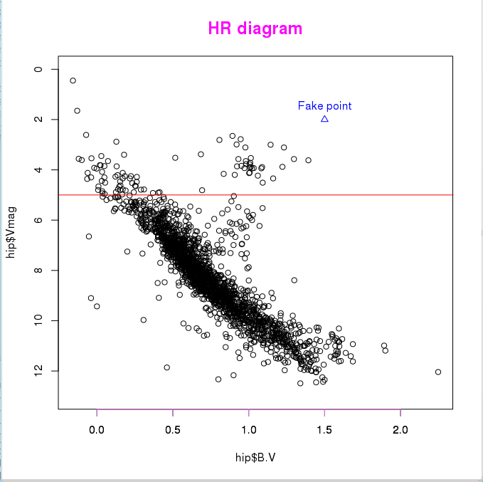
> hip <- read.table("http://www.iiap.res.in/astrostat/tuts/HIP.dat",  # read web file
+                    header=TRUE, fill=TRUE)  # fill=TRUE if some rows have missing values

> names(hip)
[1] "HIP"   "Vmag"  "RA"    "DE"    "Plx"   "pmRA"  "pmDE"  "e_Plx" "B.V"     # show columns

> plot(hip$B.V,hip$Vmag,ylim=c(13,0))         # scatter plot (black open circle points)
> lines(c(-1,2.5),c(5,5), col="red")
> points(c(1.5),c(2), pch=2, col="blue")
> text(1.5,1.5, "Fake point", col="blue")
> title(main="HR diagram", cex.main=1.5, col.main="magenta")
> axis(1, col="violet")
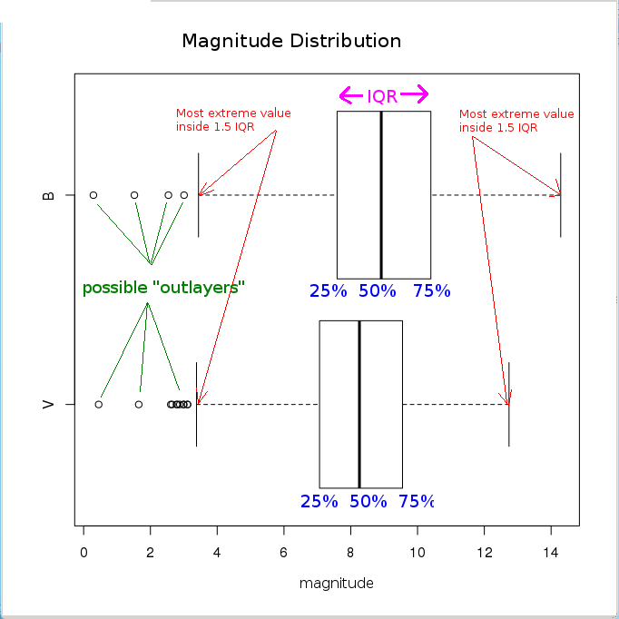
Let’s analyse the distribution of star magnitudes we have just loaded. We will first create a new list containing only two components:
> hipBmag <- hip$B.V + hip$Vmag                       # calculate B magnitude as "B.V" + "Vmag"
> newlist = list(V = hip$Vmag, B = hipBmag)           # generate a new named list
> names(newlist)                                      # show elements of the new list
[1] "V" "B"
> boxplot(newlist,horizontal=TRUE,                    # create a "box-and-whiskers" plot
+ main="Magnitude Distribution",xlab="magnitude")
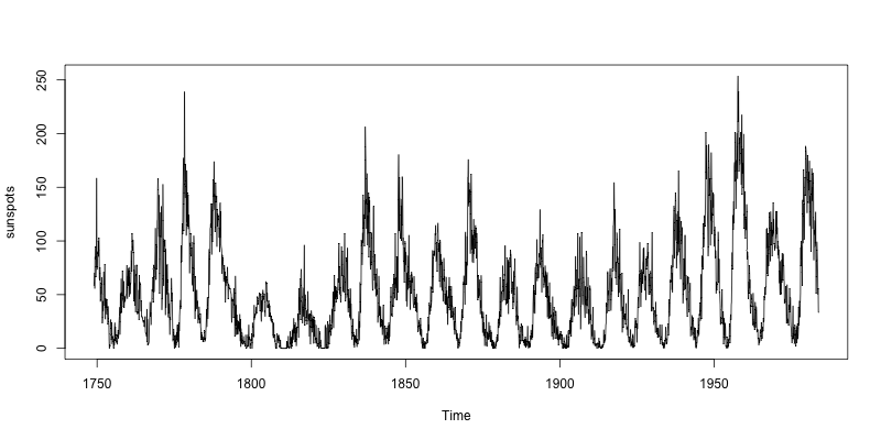
An example of time series: the monthly mean relative sunspot numbers from 1749 to 1983 (directly available in the package datasets):
> sunspots
       Jan   Feb   Mar   Apr   May   Jun   Jul   Aug   Sep   Oct   Nov   Dec
1749  58.0  62.6  70.0  55.7  85.0  83.5  94.8  66.3  75.9  75.5 158.6  85.2
1750  73.3  75.9  89.2  88.3  90.0 100.0  85.4 103.0  91.2  65.7  63.3  75.4
1751  70.0  43.5  45.3  56.4  60.7  50.7  66.3  59.8  23.5  23.2  28.5  44.0
  .     .     .     .     .     .     .     .     .     .     .     .     .
  .     .     .     .     .     .     .     .     .     .     .     .     .
  .     .     .     .     .     .     .     .     .     .     .     .     .
1981 114.0 141.3 135.5 156.4 127.5  90.0 143.8 158.7 167.3 162.4 137.5 150.1
1982 111.2 163.6 153.8 122.0  82.2 110.4 106.1 107.6 118.8  94.7  98.1 127.0
1983  84.3  51.0  66.5  80.7  99.2  91.1  82.2  71.8  50.3  55.8  33.3  33.4

> png("sunspots.png", width=800, height=400)  # define output to PNG file
> plot(sunspots)                              # plot time series
> dev.off()                                   # close PNG file
null device
          1
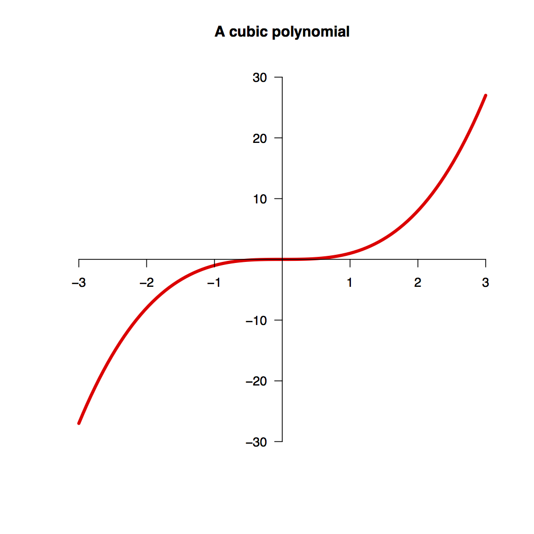
Although R provides high-level graphics facilities, these tools are built on a set of flexible low-level functions, which sometimes constitute a more flexible approach when creating plots:
# define function to be plotted
> x <- seq(-3,3,length=100)
> y <- x**3

> plot.new()                                  # a new plot is created
> plot.window(xlim=c(-3,3),ylim=c(-30,30))    # set up the world coordinate system
> lines(x,y,col="red",lw=4)                   # plot the curve (red, line width=4)
> axis(1, pos=0, at=c(-3,-2,-1,1,2,3))        # draw X-axis and ticks
> axis(2, pos=0, at=c(-30,-20,-10,10,20,30),
+      las=1)                                 # draw Y-axis and ticks
> title("A cubic polynomial")
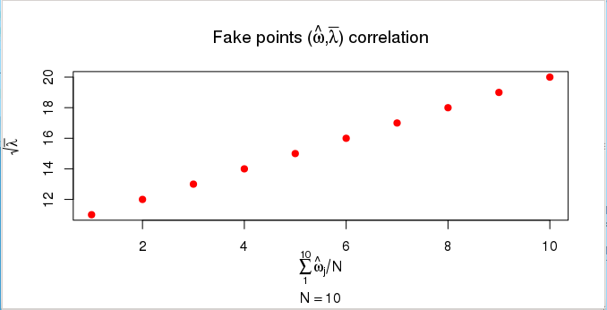
Mathematical symbols can be annotated in R graphs using expressions (expression function). The possible symbols are listed under ?plotmath. It is also possible to include computed values in the annotation:
> x <- c(1:10)
> y <- c(11:20)
> plot(x, y, main=expression("Fake points (" * hat(omega) * "," * bar(lambda) *
+ ") correlation"), xlab=expression(sum(hat(omega)[j]/N, j=1,10)),
+ ylab=expression(sqrt(bar(lambda))), sub=substitute(N == k, list(k=length(x))),
+ col="red", pch=20, cex=1.5)
With R you can also make 3D data representations:
>  demo(persp)
...
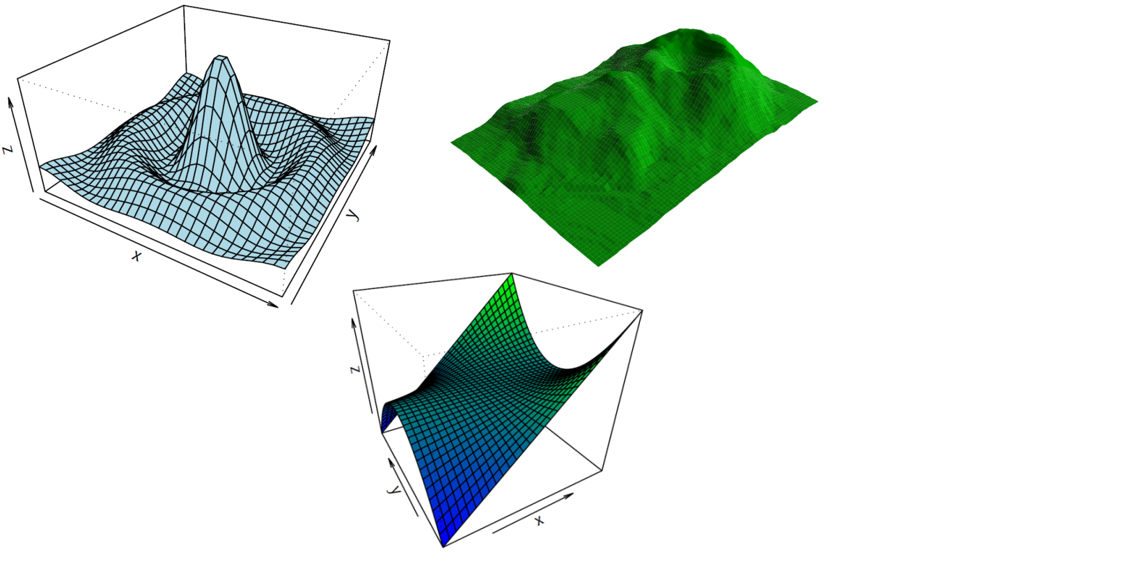
Or image representations:
> demo(image)
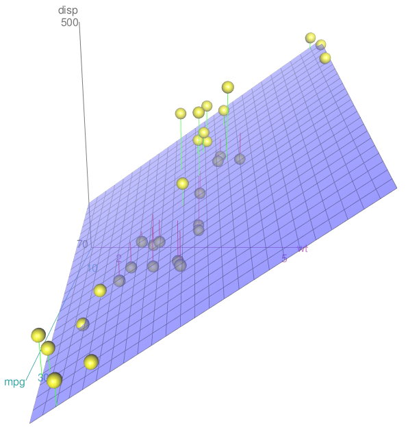
With R you can even make 3D interactive representations:
> library(car)
> attach(mtcars)
> scatter3d(wt, disp, mpg)
The colours to use in R graphs can be displayed with:
> colors()
  [1] "white"                "aliceblue"            "antiquewhite"
  [4] "antiquewhite1"        "antiquewhite2"        "antiquewhite3"
  ...
  [652] "yellow"               "yellow1"              "yellow2"
  [655] "yellow3"              "yellow4"              "yellowgreen"

> demo(colors)
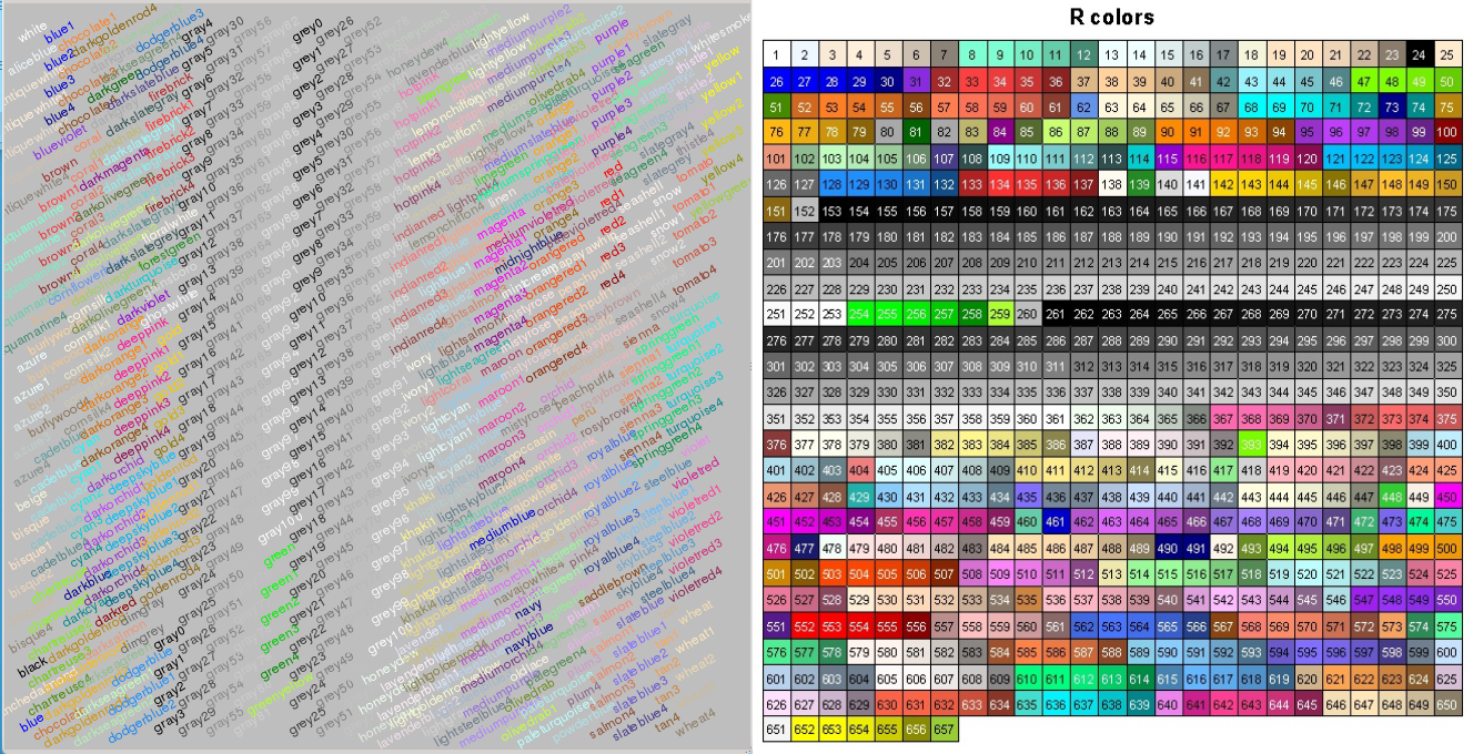
(See the Colors Chart at http://research.stowers-institute.org/efg/R/Color/Chart/index.htm)
However, the use of R colour functions (package grDevices) is highly recommendable when plotting coloured graphs.
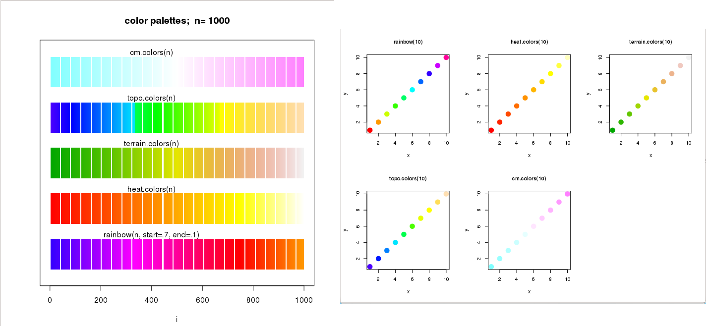
A vector of n contiguous colours can be created using the following functions:
rainbow(n, s = 1, v = 1, start = 0, end = max(1, n - 1)/n, alpha = 1)
heat.colors(n, alpha = 1)
terrain.colors(n, alpha = 1)
topo.colors(n, alpha = 1)
cm.colors(n, alpha = 1)
> x <- c(1:10)
> y <- c(1:10)

> par(mfrow=c(3,2))
> plot(x,y, pch=20, col=rainbow(10), cex=3, main="rainbow(10)", cex.main=1)
> plot(x,y, pch=20, col=heat.colors(10), cex=3, main="heat.colors(10)", cex.main=1)
> plot(x,y, pch=20, col=terrain.colors(10), cex=3, main="terrain.colors(10)", cex.main=1)
> plot(x,y, pch=20, col=topo.colors(10), cex=3, main="topo.colors(10)", cex.main=1)
> plot(x,y, pch=20, col=cm.colors(10), cex=3, main="cm.colors(10)", cex.main=1)
The n parameter refers to the number of palette colours requested, and alpha is the number in [0,1] specified to get transparency (see full documentation in help(rainbow)).
There are functions in R that return functions that interpolate a set of given colours to create new colour palettes and colour ramps:
> pal <- colorRamp(c("green","blue"))                 # define the function

> pal(0)                                              # column 1: RED content
      [,1] [,2] [,3]                                  # column 2: GREEN content
 [1,]    0  255    0                                  # column 3: BLUE content

> pal(0.5)
      [,1]  [,2]  [,3]
[1,]    0 127.5 127.5

> pal(1)                                              # BLUE colour
     [,1] [,2] [,3]
[1,]    0    0  255

> pal(seq(0,1,len=5))
      [,1]   [,2]   [,3]
[1,]    0 255.00   0.00
[2,]    0 191.25  63.75
[3,]    0 127.50 127.50
[4,]    0  63.75 191.25
[5,]    0   0.00 255.00
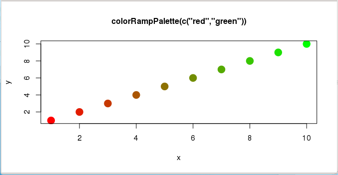
> x <- c(1:10)
> y <- c(1:10)

> mypal <- colorRampPalette(c("red","green"))

> mypal(10)
 [1] "#FF0000" "#E21C00" "#C63800" "#AA5500" "#8D7100" "#718D00" "#55AA00"
 [8] "#38C600" "#1CE200" "#00FF00"

> plot(x,y, pch=20, col=mypal(10),
+      cex=3, main="colorRampPalette(c(\"red\",\"green\"))", cex.main=1)
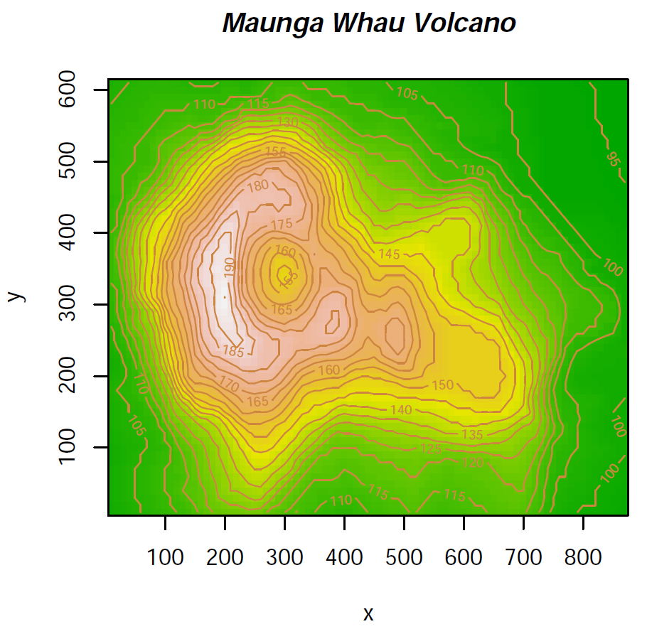
There is one package installable from CRAN with additional colour palettes (sequential, diverging and qualitative palettes), that can be used with colorRamp and colorRampPalette: RColorBrewer
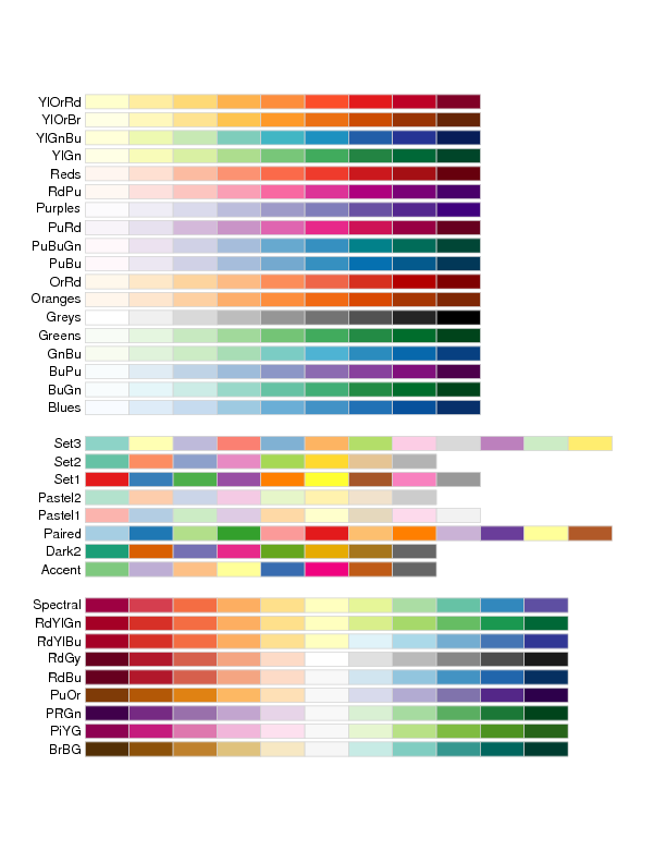
> library(RColorBrewer)                       # load library

> colors <- brewer.pal(4, "YlOrRd")           # select 4 of the 9 colours from "YlOrRd" sequence

> colors                                      # show colours selected
[1] "#FFFFB2" "#FECC5C" "#FD8D3C" "#E31A1C"

> mypal <- colorRampPalette(colors)           # create a new (interpolated) palette

> image(volcano, col = mypal(20))             # plot image using 20 colours from new palette
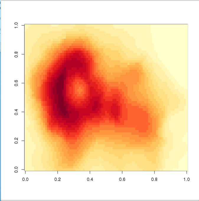
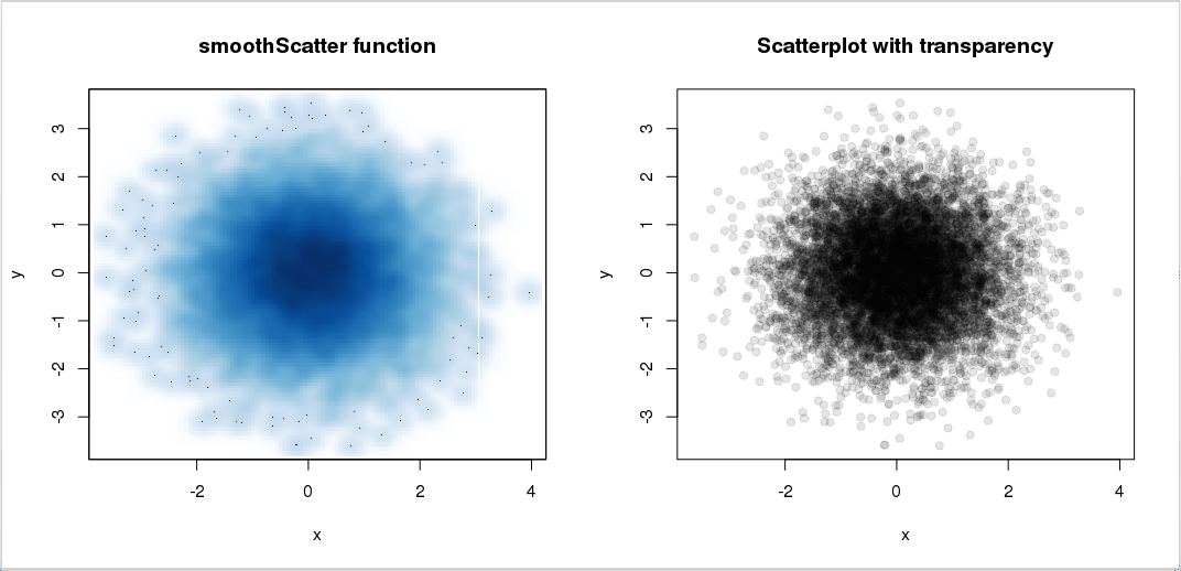
When plotting a scatter plot with a lot of points, two options can be used to clarify the plot: smoothScatter and transparency:
> x <- rnorm(10000)
> y <- rnorm(10000)
> par(mfrow=c(1,2))
> smoothScatter(x, y, main="smoothScatter function")
> plot(x,y,col=rgb(0,0,0,0.1), pch=19, main="Scatterplot with transparency")